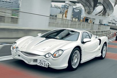
What happens when you take a Ferrari Enzo-styled car, add it some Mercedes-Benz style headlights, and give it the biggest dosage of ugly this side of the Pontiac Asstek (Aztek)? You get this hot mess known as the Mitsuoka Orochi:

--- Car Style: The Mitsuoka Orochi ---
Saying that you love a car like this is like a guy saying he loves his women to be ugly-looking to the point where nobody wants to date her. Guys in pop culture would say "I'd hit that." Well, you must have a sad life if you'd "hit" THIS car. Of all Japanese makes (big or small), Mitsuoka makes some of Japan's ugliest cars (to me). This car is more like the usually-beautiful female celebrity that makes a terrible choice of fashion and looks terrible from top to bottom.
Exterior.
The front headlights have a Mercedes-Benz style look to them. They actually look very nice on this car. The front grill looks like a shark with a narrow mouth. If the grill doesn't scare you, maybe the openings at the front of the car will. And if THAT doesn't help, look at its aggressive front hood. It has four sets of openings on either side of the front bonnet. And in the middle lies an extra long piece dividing the two sides of the front bonnet. Thank goodness the side mirrors aren't ugly. Overall, this car exudes ugliness up front. Even if you paint it black, it's still Whoopi Goldberg ugly.
The sides aren't really that bad. The wheels that come with the Orochi are actually quite lovely, as are the side duct designs on the sides. They aren't that bad. Dramatic fenders add a sweet touch to this car's side character and aren't as much of an eyesore as the front of the car. The side windows are somewhat reminiscent of the McLaren F1 to me. The windshield even has a little McLaren F1 character to it. Aggressive, yet beautiful side skirts are ready to howl through the wind at speed.
The rear is much less of a hot mess. The rear is actually styled quite nicely and not as grotesque as the front. A nice set of taillights make up the lighting arrangements for the back. An aggressive-looking rear bonnet for this mid-engine car adds some serious character to this car. A pair of small mufflers accentuate the rear of the car. The only ugly elements are the little openings between the taillights and below the rear bumper.
Interior.
The front is terrible, the sides are lovely, and the rear is... very manageable. What about the inside? Not sure whether to say ugly or cheap or what. There is LOTS of leather accentuating the dashboard and the sides. I don't think I've seen an interior that almost all leather. The interior looks nice, but all the leather is just tacky and ugly. Almost an overkill of leather on the inside. I'd hate to imagine if one of these were driven on a hot day, and you had to make sure not to touch the leather or something.
As a whole, this entire car is ugly. With better styling cues, this car would be MUCH lovelier. The sides and most of the rear are this car's only saving grace from just begging to be taken to the car crusher. Marvel at its uniqueness, but make sure you don't throw up or soil your underwear at the sight of this thing. When in doubt, envision your favorite Sports Illustrated Swimsuit Edition model and try not to let this brutal Japanese gargoyle give you nightmares.


No comments:
Post a Comment